Spruce It Up

The landscape of web typography is changing quickly these days. We’ve gone from the wild west days of sIFR to Cufón to finally seeing font embedding seeing wide spread adoption by browser developers (and soon web designers) with @font-face. For those who’ve felt limited by the typographic possibilities before, this has been a good year.
As Mark Boulton has so eloquently elucidated, @font-face embedding doesn’t come without its drawbacks. Font files can be quite large and FOUT—that nasty flash of unstyled text—can be a distraction for users.
Data URIs
We can battle FOUT by using Data URIs. A Data URI allows the font to be encoded right into the CSS file. When the font comes with the CSS, the flash of unstyled text is mitigated. No extra HTTP requests are required.
Don’t be a grinch, though. Sending hundreds of kilobytes down the pipe still isn’t great. Sometimes, all we want to do is spruce up our site with a little typographic sugar.
Be Selective
Dan Cederholm’s SimpleBits is an attractive site.

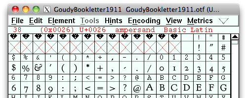
Take a look at the ampersand within the header of his site. It’s the lovely (and free) Goudy Bookletter 1911 available from The League of Movable Type. The Opentype format is a respectable 28KB. Nothing too crazy but hold on here. Mr. Cederholm is only using the ampersand! Ouch. That’s a lot of bandwidth just for one character.
Can we optimize a font like we can an image? Yes. Image optimization essentially works by removing unnecessary image data such as colour data, hidden comments or using compression algorithms. How do you remove unnecessary information from a font? Subsetting.
If you’re the adventurous type, grab a copy of FontForge, which is an open source font editing tool. You can open the font, view and edit any of the glyphs and then re-generate the font. The interface is a little clunky but you’ll be able to select any character you don’t want and then cut the glyphs. Re-generate your font and you’ve now got a smaller file.
There are certainly more optimizations that can also be made such as removing hinting and kerning information. Keep in mind that removing this information may affect how well the type renders.
At this time of year, though, I’m sure you’re quite busy. Save yourself some time and head on over to the Font Squirrel Font Generator.
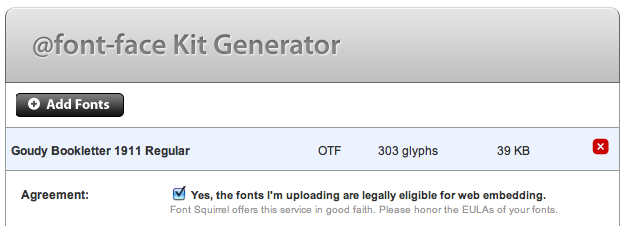
The Font Generator is extremely handy and allows for a number of optimizations and cross-platform options to be generated instantly. Select the font from your local system—make sure that you are only using properly licensed fonts!
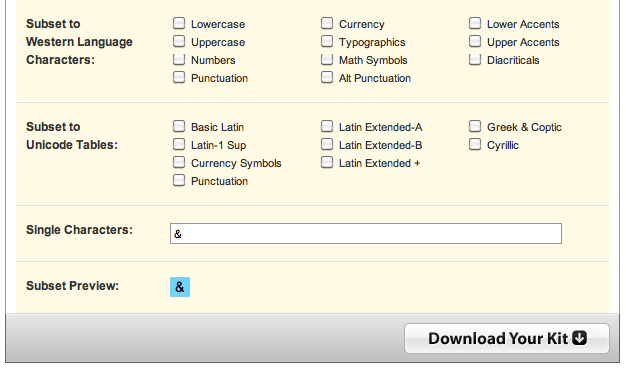
In this particular case, we only want the ampersand. Click on Subset Fonts which will open up a new menu. Unselect any preselected sets and enter the ampersand into the Single Characters text box.
Generate your font and what are you left with? 3KB.
The Font Generator even generates a base64 encoded data URI stylesheet to be imported easily into your project.
Check out the Demo page. (This demo won’t work in Internet Explorer as we’re only demonstrating the Data URI font embedding and not using the EOT file format that IE requires.)
No Unnecessary Additives
If you peeked under the hood of that demo, did you notice something interesting? There’s no <span> around the ampersand. The great thing about this is that we can take advantage of the font stack’s natural ability to switch to a fallback font when a character isn’t available.
Just like that, we’ve managed to spruce up our page with a little typographic sugar without having to put on too much weight.
About the author
Jonathan Snook writes about tips, tricks, and bookmarks on his blog at Snook.ca. He has also written for A List Apart and .net magazine, and has co-authored two books, The Art and Science of CSS and Accelerated DOM Scripting. He has also authored and received world-wide acclaim for the self-published book, Scalable and Modular Architecture for CSS sharing his experience and best practices on CSS architecture.
Photo: Patrick H. Lauke
Brought to you by
Related articles
-
An Introduction to Variable Fonts
Jason Pamental forges a path through the freshly laid snowy landscape of variable fonts. Like a brave explorer in a strange new typography topology let Jason show you the route to some fantastic font feats. Everything you thought you knew has changed.
-
Interactivity and Animation with Variable Fonts
Mandy Michael turns the corner on our variable font adventure and stumbles into a grotto of wonder and amazement. Not forgetting the need for a proper performance budget, Mandy shows how variable fonts can free your creativity from bygone technical constraints.
-
Managing Flow and Rhythm with CSS Custom Properties
Andy Bell rings out a call for a more flexible method of achieving consistent vertical rhythm across components within a page. Using a technique of CSS custom properties to establish spacing inherited through the cascade, you can make sure your choir are all singing from the same song sheet.
-
Get the Balance Right: Responsive Display Text
Richard Rutter shepherds a tea towel onto our collective heads and describes a technique for responsively scaling display text to maintain a consistent feel in both landscape and portrait screen orientations. That should put things back into proportion.
-
Run Ragged
Mark Boulton completes our calendar with some typographic techniques to improve the reading experience. Typography, like Christmas and advent calendars, relies on the accumulation of small gains for its best effects.
-
Get Expressive with Your Typography
Richard Rutter adapts an extract from his forthcoming book on web typography and encourages us to be brave with type choices. By allowing type to express a website’s intentions from even before the moment a visitor starts to read, we can help set the tone and our users’ expectations.